Tuesday, April 21, 2009

TUTORIAL 20:

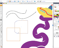
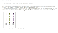
I am really excited about this tool that I have just discovered. I had no idea that there was a tool specifically to create dashed or spotted lines. This, along with many other tools I have just recently discovered, could have saved me plenty of time with my past projects. I like how you can have them be different too, not just spotted or dashed, but there is a) butt cap :/ 2) Round cap and 3) projecting cap. Each one brings something different to the table, but keeps the general idea.

Website: http://livedocs.adobe.com/en_US/Illustrator/13.0/help.html
Link: Painting with fills and strokes (create dotted or dashed lines)
TUTORIAL 19:

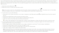
I have said before that I have had trouble with the painting tools, well, it was true of course and that's why I am watching/reading/listening to as many paint tutorial things I can. This just has instructions on how to paint with the live paint-bucket tool. It explains on how you can paint more than one surface at a time, how to choose the color, how to select what you want to paint, and how to dis-select what you don't want to paint. I can see myself using this all of the time, and for now, I think it will be very helpful to have this on hand.

Website: http://livedocs.adobe.com/en_US/Illustrator/13.0/help.html
link: Paint with the live paint-bucket tool

TUTORIAL 18:


3 words: ILLUSTRATOR BRUSH LIBRARY...I cannot even explain how many times I have wanted a very specific type of paint brush, but I didn't think they would have it because it wasn't just pasted on my face telling me about them. So this brush library has a bunch of different kinds of each type of brush. I also didn't know that If you have your objects selected, you can change the outline to a certain brush type. Very convenient. 

Website: http://www.adobe.com/designcenter/video_workshop/?id=vid0044
Link: Using brushes from brush libraries

TUTORIAL 17:

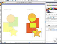
This would have come in very handy last week. For my 118 project I did the whole "overlapping" shapes thing, and I just used the opacity tool and edited them to be lighter or darker when objects overlapped. I tried to figure out how to change the specific colors to the objects that overlap but I did not...until now. The paint tool is very tricky for me for some reason, and I plan on watching more of these paint related ones until I finally understand this. I knew there was a way to do this, I was just waiting till the day I picked the right tutorial :). Today I did.

Website: http://livedocs.adobe.com/en_US/Illustrator/13.0/help.html
Link: Using Live Paint

TUTORIAL 16:

I know how lame this is, since it is a tutorial on paper (which would be okay) but it has only one line....HOWEVER, I have been trying to figure out how to do this all week!!! I have been wanting to figure out how to move anchor points, and I even asked somebody, and understood what they said, but when I tried to do it, I failed and totally blanked. This "tutorial" has simple instructions on how to edit your anchor points to place them where you want to. Now, I will have these instructions with me always.

Friday, April 17, 2009

PCP (not the drug)


IF I EVER MEET JOE DUFFY I ONLY HAVE ONE THING TO SAY TO HIM: Harry Potter called, he wants his glasses back.

Here's my final product for the Post Card Project that I did on Joe Duffy. Duffy is this creative director for the firm Duffy & Partners (which he started) and does very popular advertising. It was a little tough making a post card that represented him because he doesn't have a specific credited style, but his work is fantastic. I was really excited for this project for some phenomenal reason, maybe because graphic design kicks other majors asses. It started out really well, then I hit a bump, well, maybe like a 9 story building that was 3 miles wide, in which, I wasn't enjoying it anymore cuz the turnout was shit and I was stressing out about it but whatever. Then It got back on track and I really started to have some fun with it and took some risks. I just started experimenting with some cool effects that illustrator offered which was super fun and not lame, and I think it turned out pretty decent. Also, it didn't hurt that Duffy is the bees knees, or rather, the cats pajamas, or los pijames de gato for all you spanish speaking foke.

TIMES NEW ROMAN AINT SO NEW


Soooo, I've come to realize that text is cool. My taste has totally changed now because I try to include some creative typography in everything. I don't even have much skills, just accidental typography skills. The images that I think are the most interesting are the ones with random letters, and all that. I think I just like the organized chaos of it all. Font is so much more than just left to right Times New Roman. Who knew!
p.s. yes, this font I used is......times new roman.......awkward

TUTORIAL 15:

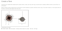
I usually "don't like to talk about my flare" but I am so excited that this tool is available. With the flare tool you can create objects with a bright center like halos, a sun, rays and rings. Creating such a design is pretty dang hard, and this tool makes it so much easier. I'm glad that they thought of something like this, so that if I need an incredibly bright object, that is almost impossible to create on your own, you can use this tool. The blur tool would probably help out too if you chose the right colors. I think it's cool that these tools are so handy in trying to make your design good.

website: http://livedocs.adobe.com/en_US/Illustrator/13.0/help.html
link: Create a Flare

TUTORIAL 14:

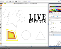
I had no idea you could do this. I've tried to outline designs simply by trying to recreate it, but this affect path tool can create many copies of the same shape. I think this will be completely helpful, it will save so much time. You can just put it how far apart you want the shapes. I really like that even after you create all of the outlines and whatever, you can still edit the original shape, and the other ones will conform to that shape. 

website: http://www.adobe.com/designcenter/video_workshop/?id=vid0051
link: Using the Appearance panel and effects

TUTORIAL 13:

I have used the alignment tool but not when I've had random objects that I want spaced out because I didn't know how to do it. This tutorial explains how to use the section of the alignment tool that I didn't know what did. The alignment tool  allows you to space out objects and you can decide how many points of space between them. I like how you don't need to have them perfectly aligned straight up and down, and can have them randomly, but perfectly spaced out all over the place.

website: http://www.adobe.com/designcenter/video_workshop/?id=vid0035
link: Aligning and distributing objects.

TUTORIAL 12:

Picking out a color scheme is one of the hardest things ever. It is so hard to decide because you want to mix in all of your favorite ones, but that doesn't mean they work together. Illustration sets up planned swatches, and color schemes that work well together. I think that would be a great start, because then you can get inspired by the colors, play with them and their values, and create something new and cool. I will definitely use this in the future, or at least use it as a base point to creating my own color palette.

website: http://www.adobe.com/designcenter/video_workshop/?id=vid0059
link: Creating, editing, and experimenting with color groups.

TUTORIAL 11:

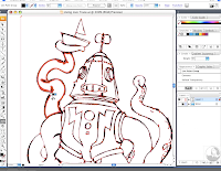
I have never thought of tracing my drawings, because I figured you could always make it so much better by starting from scratch on illustrator. Now, I think it could really come in handy. Kate talked about tracing and how it can make the design have a hand-drawn feel, and sometimes you may want it in that style. I couldn't figure out how to use the tracing tool, and what buttons to push, but it seems really simple. I excited to give it a shot one of these times.

website: http://www.adobe.com/designcenter/video_workshop/?id=vid0043
link: Using live trace and live paint.

Wednesday, April 15, 2009

JDUFFY


Joe Duffy


Joe Duffy is the graphic designer I am doing my second project (postcard) on. He is from Minneapolis, MN, and is founder and creative director of Duffy & Partners. Duffy & Partners is a small graphic design firm that does branding, design, logos, corporate identity and packaging for very well-known companies. His (& the company's) work has been in stores, in the media, in art galleries, and many retail environments. He has done many designs that are extremely popular and were (are) very successful. He's doing my dream job, and everything he has done is very rad. He has worked for Starbucks (the new double shot design), fresca, Coca-Cola, American Eagle (the falcon), Race for the cure (the ribbon), Rainforest Cafe (the name design), Jim Beam, Sony, Aveda men and a bunch of others. Most of their clients were needing something fresh, and something to shine light on there products. Duffy & Partners have won awards on designs, and are beautifully creative. I posted the link to Duffy & Partners below.
http://www.duffy.com/

Monday, April 13, 2009

PATTERN PROJECT:


The pattern project was a lot more fun than I thought it was going to be. When I was told that it was supposed to be one letter in one typeface I was a little nervous at first and didn't think that there would be so many possible ways to create patterns with only one letter and text type. Little did I know that the possibilities were endless, and my biggest problem (besides the whole alignment situation) was picking which pattern I liked the best. Patterns can be created in so many ways, and I think this assignment really opened the door to a whole different kind of design that I haven't really ever given much thought of.

ADOBE LIVE DOCS

I had a pretty neat experience with the adobe live docs. I really enjoyed the film ones because i'm more of a visual person and it helped to actually see it done. I do wish they had more film ones but it the have simple enough directions to where I should be able to figure it out. It definitely had a lot more information available then the other tutorial page. It describes how to do everything in really easy steps that I could even get right. I'll probably look more into the applying color and paint tools, because when I tried to do that on my own I got really confused, and the site made it sound so easy. I will also most likely take a closer look at the pen tool because I really want to take advantage of that tool. I bookmarked adobe live docs, and I'm sure as I go along and do projects or just screw around on illustrator, I'll have a simple question that can easily be answered and described in full detail. I am still a little intimidated but definitely not as much, and I am feeling more comfortable just testing out different tools and seeing where it takes me.

website: http://livedocs.adobe.com/en_US/Illustrator/13.0/help.html

TUTORIAL 10:

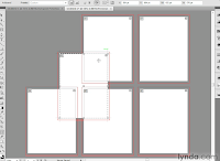
You can have multiple art-boards, and overlap other art boards them which I think is cool. Even the guy said that no other application allows you to do that. This comes in handy if you want to make a drawing and make it span over multiple pages. You can also make an art-board within another art-board. He used the example of business cards, so you can make a few business cards on one art board, and then grab one specific art board within the other art-board and make it it's own. 

website: http://www.lynda.com/home/DisplayCourse.aspx?lpk2=733
link: Special artboard controls 

TUTORIAL 9:

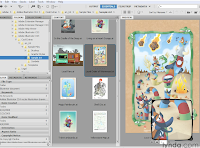
You can preview your assets in the adobe bridge and modify, and zoom in and edit and everything. I had no idea that this bridge thing existed. I don't really know everything it does, and I don't completely understand it yet, but it seems pretty useable. You can open files and sample files, and preview designs or pictures and have them all open on the same page which seems convenient. I hope to learn more about this adobe bridge situation. 

website: http://www.lynda.com/home/DisplayCourse.aspx?lpk2=733
link: Introducing Adobe Bridge

TUTORIAL 8:

I had no idea that with the color palette, you can completely altar the color to make it exactly what you want. By submitting different percents to each value of the color, it changes it and you can make up your own colors if it isn't listed. I really like that you can totally make it your own, and not have to design according to the colors given to you. So yeah, it's awesome. I'm excited to do that. 

website: http://www.lynda.com/home/DisplayCourse.aspx?lpk2=733
link: modifying an illustration

TUTORIAL 7:


The pen tool apparently is either a love or hate kind of thing. The video of course makes it look easy, and you can get any kind of shape that you would be able to physically do in a sketchpad. I didn't know that you could start with a general image to work with, and then completely altar it to make it the way you want. Even with a normal circle shape, you can edit it with the anchor points and use the handles to change the object to how you want. Really cool, I hope I can be one of the "I LOVE THE PEN TOOL" people and get more experienced with it, because it seems pretty handy.

website: http://www.adobe.com/designcenter/video_workshop/?id=vid0037
link: Drawing with the pen tool

TUTORIAL 6:

I had no idea that you could alter a shape that you already have placed down on the art-board. With the pencil tool you can select shapes and rework them. I like how any shape you put down like a square or circle or something, and it can be perfect, but you can edit it and make it look any way you want to and make the regular object more interesting.

Website: http://www.adobe.com/designcenter/video_workshop/?id=vid0039
Link: Drawing with the pencil tool

Saturday, April 4, 2009

TUTORIAL 5:

I love the grid tool. When I found out how to use it (thank you Gloria) I kept using it for everything I was doing. It totally lines up everything, and the grid isn't in a large scale either, they are very small boxes inside the square 1" by 1", so it can help with any size object.

website: http://www.lynda.com/home/DisplayCourse.aspx?lpk2=351
link: Using guides and grids

TUTORIAL 4:


I like how I can completely create my own workspace. If I myself, use a tool regularly and wish for it to be in easy reach, I can do that. Everybody's workspace is different, and I can customize it to my own liking. It also talked about every little piece of empty space and how important it is. I never really acknowledged those little spaces, but they can make a huge difference. It's workspace, and it's as important in your studio as it is on the computer.

website: http://www.lynda.com/home/DisplayCourse.aspx?lpk2=351
link: Exploring panels and workspaces

TUTORIAL 3:

You can select multiple objects a couple different ways, and the easiest way is to just click in one corner and drag it over the objects you want selected. When I was doing that during the text/picture assignment, it kept on including objects I didn't want included, and I learned now that in order to get rid of the objects you don't want included you simply shift click on those objects. If you want to include another object with your entire selection, you can also shift click the object to include it. This would make it a lot easier without redoing it to get the right selection of objects you want. 

website: http://www.lynda.com/home/DisplayCourse.aspx?pk2=351
link: Selections and stacking order

TUTORIAL 2:

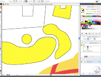
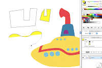
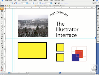
(This image is from the link: Selections and stacking order from the same website. It explains basically the same thing about the selection/direct selection tools but explains it better.)


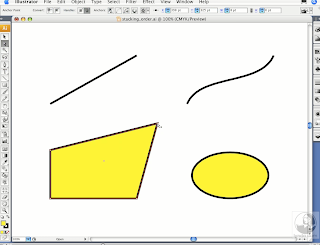
The selection tool arrow allows you to resize, readjust, reshape, and curve the object you choose. The direction selection tool arrow below the other one will just move the one anchor point that you selected. Shift click will allow you to move two objects together in synch which I think will be very valuable. So if I decide to move the scale of some objects I don't have to try each one separately, I can move them all together.

website: http://www.lynda.com/home/DisplayCourse.aspx?lpk2=351
link: Utilizing the bounding box

TUTORIAL 1:


The resolution stays with the file even if you zoom in or out. I like how you can zoom out completely and it looks almost like a different picture, and seems smoother, and when it's close up, you can see the roughness of it. I'm glad the resolution stays true to what you want, and works with you.

website: http://www.lynda.com/home/DisplayCourse.aspz?lpk2=351
link: What are vector graphics?

Wednesday, April 1, 2009

I'M EXCITED ABOUT...

*getting more in depth with graphic design
*the finished product
*Having homework that isn't lame
*Classes that are going to actually help me in the future
*finally having classes that I like
*Not wanting to leave the mac labs
*Becoming obsessed with future projects
*Being comfortable with Adobe programs
*Getting my degree in something that I enjoy
*Meeting people as excited as Kate is. :)

COMPUTER EXPERIENCE

I don't have very much computer program skills but I like to think of myself as computer literate. I can do the basic stuff, but I am not very familiar with Adobe programs such as Illustrator, Photoshop, and pretty much all of the other ones I'm going to have to learn soon. I've used Illustrator for the first time this week, and it's pretty damn sweet, and I know I just got a taste of a taste, but I am functional on a computer for the most part.

TEXT PROJECT:


This was the first assignment where we had to use text to create a picture of a celebrity. I did Jack Bauer and I think it turned out pretty neat. I want to finish it with the gun and his jacket some day soon.